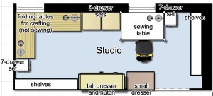
So, I got to thinking about the design for my studio, and I came up with a slightly different layout that allows for the entry to be closer to the house and farther from the roll-up doors.
This is the layout I came up with:

I’m not sure which version I like better, but I’m leaning toward this one. Still trying to come up with ideas to keep the dust to a minimum.
Yeah, the only things I can think of for the dust would walls of fabric or possibly blinds. The fabric seems easier.